Excel is a powerful spreadsheet program that can be used for a variety of tasks, from simple data entry to complex financial modeling. However, many users only scratch the surface of what Excel is capable of.
Here are five Excel tips that every user should know, regardless of their skill level. Many users only use Excel for basic tasks like making tables and charts, but they are missing out on the more advanced features that can make them far more productive and efficient.
This article will share five tips every Excel user should know to get the most out of this versatile program. Mastering these useful tips and tricks can help you save time, automate repetitive tasks, visualize data more effectively, and avoid common errors. Let’s get started!
Unlock Excel Mastery: 5 Must-Know Tips for Beginners to Experts
Tip 1: Use Keyboard Shortcuts

Keyboard shortcuts can save you time and improve your efficiency in Excel. For example, you can use the Ctrl + C and Ctrl + V shortcuts to copy and paste data, respectively. This eliminates the need to navigate the Ribbon menu to access these common commands.
You can also use the F4 key to repeat your last action. If you want to apply the same formatting across multiple cells, you can format the first cell, hit F4 to repeat it, and continue selecting new cells. This shortcut alone can save significant time compared to reformatting each cell manually.
Other useful keyboard shortcuts include:
- Ctrl + Z: Undo last action
- Ctrl + Y: Redo last action
- Ctrl + S: Save current workbook
- Ctrl + F: Open Find dialog box
- Ctrl + H: Open Replace dialog box
- Ctrl + D: Fill down
- Ctrl + R: Fill right
- Ctrl + L: Select current cell
- Ctrl + Arrow keys: Navigate to cell edges
To learn more about Excel keyboard shortcuts, you can search for them online or consult the Excel help documentation. There are dozens of shortcuts available, and memorizing the most commonly used ones can boost your speed and productivity.
Example of Using Keyboard Shortcuts
For example, let’s say you have a dataset of 100 rows. You want to copy the formatting from row 1 (make the text bold and center aligned) and apply it to the rest of the rows quickly.
Instead of copying the format and pasting it to each cell, you can use shortcuts:
- Select row 1 and apply the desired formatting.
- Press Ctrl + Y to redo the last action, which will reapply the formatting.
- Hit F4 repeatedly to apply the formatting to rows 2, 3, 4, etc.
This allows you to reformat 100 rows in seconds compared to the tedious manual work of selecting each cell and copying/pasting formats.
Tip 2: Use Formulas

Formulas are the backbone of Excel. They allow you to perform calculations on your data and generate new results. Here are some examples of commonly used Excel formulas:
- SUM: Add up values in a range of cells.
=SUM(A1:A10)totals the numbers between cells A1 and A10. - AVERAGE: Calculate the mean average of a cell range.
=AVERAGE(B1:B10)averages all values between B1 and B10. - IF: Create conditional logic based on meeting criteria.
=IF(C1>100,"High","Low")shows “High” if C1 exceeds 100, otherwise, “Low”. - VLOOKUP: Lookup and retrieve data from other sheets or tables.
=VLOOKUP(D1,Sheet2!A:B,2,FALSE)looks for D1 in Sheet 2, column A, and returns the match from column B. - CONCATENATE: Join text strings together.
=CONCATENATE(A1," ",B1)combines the text in cells A1 and B1 with a space between them.
These are just a handful of the hundreds of native Excel formulas available. Each serves a different purpose, and they can be nested together to create complex calculations and analyses.
You can review the formulas library and functions list in Excel’s help documentation to learn more about Excel formulas. This provides definitions and usage examples for every formula. You can also search online for specific formula help and examples.
Mastering Excel formulas unlocks the true power and potential of spreadsheets.
Example of Using Formulas
Let’s look at an example using real data. Suppose you run an e-commerce store and want to analyze your sales numbers for the month:
| Week | Revenue |
|---|---|
| Week 1 | $10,000 |
| Week 2 | $8,000 |
| Week 3 | $9,000 |
| Week 4 | $12,000 |
Instead of manually calculating the total revenue, you can create a formula to do it instantly:
=SUM(B2:B5)
This formula will add up the values in cells B2 through B5, returning a total revenue of $39,000 for the month.
You can also add a new column for the weekly growth rate using a formula that divides the current week by the prior week. This formula will go in C2 and be copied down:
=B2/B1
Formulas allow you to save time, reduce errors, and conduct deeper analysis – making them an indispensable tool for all Excel users.
Tip 3: Use Conditional Formatting
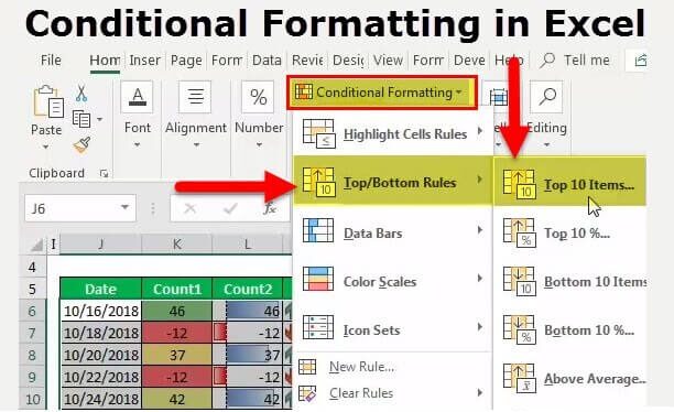
Conditional formatting in Excel allows you to format your data dynamically based on specified conditions or criteria. For example, you may want to highlight negative values in red or flag results greater than a threshold.
Some ways to use conditional formatting:
- Color scale: Shade cells based on their values, with light to dark color representing low to high numbers. Useful for quick visual insights.
- Data bars: Add horizontal bars behind cells to indicate their value relative to other cells. Makes it easy to see higher and lower numbers.
- Icons: Add icons like arrows or symbols next to cells that meet criteria. Icons can represent higher, lower, or equal to a benchmark.
- Duplicate values: Format duplicate cells for easy identification of repeats. Helps spot erroneous data entry.
- Specific text: Highlight cells containing custom text values, like coloring any cells with “TBD” red as a reminder.
- Top/bottom rules: Highlight top or bottom ranked values like top 10 and bottom 5. Useful for benchmarks and goals.
The possibilities for creative uses of conditional formatting to extract visual insights are endless. Some Excel tips are learning shortcuts and handy tricks. Conditional formatting is more of a fundamental skill that every Excel user should take time to master.
Example of Using Conditional Formatting
For example, you have a sales dashboard tracking revenue target performance. You want to flag any regions underperforming their goals quickly:
| Region | Revenue | Target |
|---|---|---|
| West | $50,000 | $100,000 |
| North | $80,000 | $50,000 |
| South | $90,000 | $75,000 |
| East | $60,000 | $150,000 |
You can apply conditional formatting to compare Revenue to Target and highlight any cells where Revenue is less than Target. This makes underperforming regions visually jump out.
Conditional formatting is a powerful tool for dashboards and reports. It goes beyond basic formats to provide visual insights that standard spreadsheets miss.
Tip 4: Use Pivot Tables

Many Excel users are familiar with basic calculations, functions, and formatting. However, pivot tables remain an underutilized – but invaluable – tool for many.
Pivot tables allow you to analyze and summarize large datasets efficiently. Some key pivot table features include:
- Grouping data by specific columns or fields
- Filtering your data by value, text, date, or other criteria
- Sorting results based on various parameters
- Summarizing metrics with sum, average, count, etc.
- Generating customizable reports and summaries
With pivot tables, you can take raw datasets containing thousands of rows and dynamically analyze them from different angles.
Some examples of using pivot tables:
- Summarize revenue by region, product, sales rep, etc.
- Group customers by lifetime value bands to identify top tiers
- Filter product data to analyze best selling items
- Compute average order value by date to spot trends
- Count new customers added by marketing channel
The flexibility of pivot tables makes them an essential tool for data analysis. The uses are virtually endless.
Example of Using Pivot Tables
Let’s walk through a simple pivot table example. Say you have raw sales data showing the product, region, and revenue for each transaction:
| Product | Region | Revenue |
|---|---|---|
| A | East | $100 |
| B | West | $50 |
| A | East | $25 |
| C | North | $75 |
You want to summarize total revenue by product. Here are the pivot table steps:
- Select your dataset and insert a pivot table.
- Add “Product” as the Rows field.
- Add “Sum of Revenue” as the Values field.
The pivot table will automatically group the results by product and display the total revenue for each:
| Product | Sum of Revenue |
|---|---|
| A | $125 |
| B | $50 |
| C | $75 |
Just like that, the raw transactions are summarized into product revenue totals using a pivot table. This example only scratches the surface of what pivot tables can do. Their flexibility and analytical power makes them one of the top Excel tips for beginners to learn.
Tip 5: Use Charts and Graphs

Visualizing your Excel data with charts and graphs can provide quick insights into trends, patterns, comparisons, and more. Excel supports a wide array of chart and graph options to suit different analytical needs:
- Line charts: Ideal for showing trends over time with continuous data points connected by lines.
- Column charts: Great for comparing metrics between different discrete categories using vertical columns.
- Pie charts: Use to visualize part-to-whole relationships through percentages or proportions.
- Scatter plots: Plot data points against two different variables to analyze correlations.
- Histogram: Show frequency distributions and value counts with rectangular columns.
- Waterfall: Display sequential increases and decreases between initial and end values.
- Gantt chart: Illustrate project timelines and schedules with horizontal bars against a calendar.
With just a few clicks, you can turn stale spreadsheet data into colorful visualizations that are easier for audiences to digest. The right chart or graph can instantly surface key trends, outliers, and patterns.
Example of Using Charts
Let’s walk through an example. Suppose you have a table tracking website traffic by month:
| Month | Visits |
|---|---|
| January | 200 |
| February | 150 |
| March | 180 |
| April | 220 |
Select the table data and insert a line chart to visualize the monthly trend. Excel will automatically plot the months on the x-axis and visits on the y-axis, with a connecting line showing the rise and fall in traffic.
This line chart immediately highlights that traffic peaked in April, and provides a clearer picture than the raw dataset alone.
Charts allow you to communicate insights from Excel visually. While Excel tables are great for housing data, charts help tell the story.
Examples
Here are some examples of how these five Excel tips can be applied:
Keyboard Shortcuts
Jennifer needs to copy a summary table from one worksheet to another. Instead of right clicking to copy and paste, she highlights the table and uses Ctrl + C to copy and Ctrl + V to paste in the new sheet. This saves her several clicks for a task she does frequently.
John is formatting a report in Excel. Rather than navigating through menus to change font, sizes, borders, etc he uses keyboard shortcuts like Ctrl + B for bold, Ctrl + I for italics, and Ctrl + Shift + –> for right align. This helps him format the report quickly.
Formulas
Andrew wants to summarize total sales for the year in an Excel report. Rather than manually adding all the values, he uses the formula =SUM(B2:B52) to calculate the total automatically. He can update this formula if his data changes instead of redoing the math.
Sara needs to count the number of orders over $500. She uses the =COUNTIF formula to save time instead of counting manually. She enters =COUNTIF(D2:D100,”>500″) to have Excel count orders over 500 for her.
Conditional Formatting
Mark wants to color code profit values in his sales report spreadsheet from red (negative profit) to green (high positive profit). He selects the profit cells, creates a 3-color scale conditional format from red to yellow to green. Now he can instantly visualize relative profit levels.
Michelle wants to highlight duplicate entries in a customer mailing list. She selects the list, creates a conditional format to highlight duplicate values, making them easy to spot and remove.
Pivot Tables
James has a large dataset of daily sales he wants to summarize. He creates a pivot table from the data, adds Region and Salesperson to the rows, Sale Amount to values and adds a filter for Year. Now he can quickly analyze sales by region, rep and year all in one view.
Anna needs to present website traffic data by month and source. She inserts a pivot table, drags Date and Source to rows, and Pageviews to values. She filters to the current year and sorts the months chronologically. Now she has an instant summary to share with stakeholders.
Charts
Bob wants to show revenue growth over the last 5 years in an investor presentation. He selects the Years and Revenue columns and creates a line chart. The chart demonstrates the upward trend in revenue to his audience.
Jasmine wants to visualize product sales proportions in her region. She selects the product names and units sold, then inserts a pie chart. The pie chart makes it easy to see which products comprise the largest (and smallest) sales percentages.
Troubleshooting

Here are some common problems users encounter with these Excel tips and how to solve them:
Keyboard Shortcuts
Problem: You entered a keyboard shortcut but nothing happens or Excel performs the wrong action.
Solution: Ensure you enter the exact shortcut correctly and check for typos. Refer to an Excel keyboard shortcut cheat sheet online to confirm syntax. Also check that your Caps Lock is not accidentally turned on.
Problem: You can’t remember all the available keyboard shortcuts.
Solution: Keep a list of the most common Excel shortcuts handy as a reference. Focus on memorizing 5-10 shortcuts weekly until they become second nature through practice.
Formulas
Problem: The formula returns an error value or wrong calculation.
Solution: Double-check that all cell references are correct. Make sure formula arguments match the right syntax and order. Use auditing tools to check for errors and confirm formula logic.
Problem: Formula output doesn’t update when source values change.
Solution: Confirm formula references use absolute vs relative cell references appropriately. Make sure the calculation setting is set to automatic to recalculate. Press F9 to recalculate all sheets manually.
Conditional Formatting
Problem: Rules don’t apply correctly, or cells aren’t formatting.
Solution: Check the Applies To range to select the correct cells. Ensure cells meet the logical criteria and formatting conditions specified. Adjust the formula logic or values as needed.
Problem: Too many conflicting conditional format rules cause slow down.
Solution: Limit the number of rules per worksheet. Simplify overly complex formulas. Apply rules only where needed instead of the full sheet.
Pivot Tables
Problem: Fields, calculations or formatting don’t appear as expected.
Solution: Right click on any part of the pivot table and choose Refresh to update everything at once. Check the Field List pane for correct field placements.
Problem: Pivot table doesn’t reflect source data updates.
Solution: Click the Refresh button on the Analyze tab. Go to Options and confirm that pivot cache setting is set to refresh with data changes.
Charts
Problem: Chart doesn’t display expected data series, axis scales are off, wrong legend labels, etc.
Solution: Ensure the right cells were selected as the original chart data source. Recheck the chart type to confirm it represents the data accurately—update legends, axes, etc.
Problem: The chart does not update when source data changes.
Solution: Right-click on the chart and select Update to refresh it. Formulas may need to be added to source data to link it dynamically to charts.
Additional Sections
Real-World Examples of the 5 Tips
Here are some examples of how these Excel tips can be used in real business scenarios:
Keyboard shortcuts – An accounting team needs to standardize formatting across hundreds of rows of financial statements. Using Ctrl + Y and F4 allows them to replicate formats vs. manual work quickly.
Formulas – A startup founder is calculating the burn rate. Formulas help analyze cash balance, monthly operating costs, and runway length in a dynamic spreadsheet.
Conditional formatting – A digital marketing agency dashboard tracks multiple revenue KPIs like clicks, conversions, etc. Conditional formatting highlights any KPIs failing targets.
Pivot tables – An e-commerce manager is reviewing sales data. She uses pivot tables to filter efficiently and subgroup orders to analyze performance by product, customer type, region, etc.
Charts – A growth analyst plots weekly active users over time as a line chart. This clearly shows user growth is stagnating, prompting further analysis.
Troubleshooting Common Issues
Users may encounter certain difficulties when attempting these Excel tips:
- Keyboard shortcuts not working – This is often due to an incorrect or outdated shortcut, or the shortcut being disabled. Check your Excel version for the right shortcuts.
- Formula errors – Formulas may return errors like #DIV/0!, #REF!, #NAME? if there are invalid references, divisions by zero, or named ranges not found. Double-check syntax and cell references.
- Slow conditional formatting – Highly conditional formatted sheets can slow Excel. Limit the number of formatting rules or adjust workbook calculation settings.
- Blank pivot fields – Pivot tables will be blank if the data source is incorrectly specified. Double-check check the base data set is selected when creating the pivot table.
- Charts not displaying – If charts show empty despite having data, the cell or table references may be wrong. Verify the chart’s mapped data points.
Frequently Asked Questions
Below are some common questions related to using Excel effectively, along with the keywords covered in this article:
1. What Are Some Key Benefits of Using Keyboard Shortcuts in Excel?
Keyboard shortcuts help boost your efficiency and productivity when using Excel. Shortcuts allow you to navigate, enter data, format, copy/paste, and execute commands faster than clicking menus and toolbars with a mouse. Mastering shortcuts for common actions will speed up your Excel workflow.
2. How Can Using Formulas Help in Excel?
Formulas are critical for performing calculations, analysis, and modeling in Excel. Formulas enable you to calculate sums, and averages, do lookups, manipulate text, perform logic tests, and much more. Using formulas allows you to work with data dynamically instead of just static values. They are essential for unlocking the true power of spreadsheets.
3. When Should I Use Conditional Formatting in Excel?
Applying conditional formatting helps visualize your Excel data’s insights, trends, and outliers. Use it when you want certain values or cells to stand out based on meeting defined criteria. This allows you to format data dynamically based on values, making your worksheets easier to analyze. It’s extremely useful in dashboards and reports.
4. What Are the Benefits of Pivot Tables in Excel?
Pivot tables help you efficiently summarize, analyze, explore, and present large datasets. With pivot tables, you can easily group, filter, sort, summarize metrics, and generate customizable reports from your data. They allow you to take raw data and look at it from different perspectives on the fly.
5. How Can Charts and Graphs Enhance Excel Workbooks?
Using the right charts and graphs lets you visually communicate insights and trends from your Excel data. Charts turn abstract spreadsheet data into more intuitive visualizations. Different chart types like column, pie, line, and scatter plots all have various uses for visualizing data in a digestible way.
6. What Are Some Key Data Elements in Excel?
At the core of Excel are fundamental data components like cells, rows, columns, worksheets, and workbooks. Cells contain individual data points and are where you input data. Rows and columns organize cells in a grid layout. Worksheets contain cells, graphs, tables etc. Workbooks contain one or more worksheets. Mastering these core components allows you to structure data properly in Excel.
Conclusion
These five tips are just the beginning. Excel has hundreds of useful features spanning formulas, tables, pivot tables, charts, and more. There are always new tricks to learn to make your data work for you.
For any Excel user at any skill level, knowing these five tips can help boost your proficiency:
- Use keyboard shortcuts to save time on routine tasks.
- Learn formulas to perform calculations and analysis.
- Apply conditional formatting to visualize insights.
- Create pivot tables to summarize data dynamically.
- Make charts to see trends and patterns.
By mastering these fundamental Excel skills, you’ll be prepared to get the most out of your spreadsheets. Don’t let the full power of Excel remain locked away. Put these tips to use in your work and see the benefits right away.